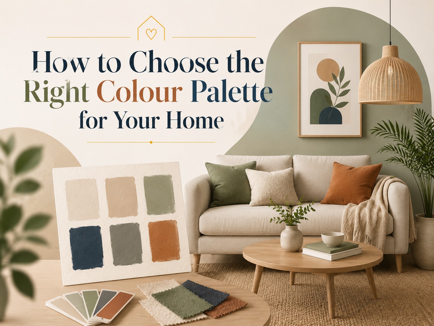
Colour is one of the most powerful tools in interior design. It can make a small room feel spacious, a cold space feel warm, a dull corner come alive, and an entire home feel like it truly belongs to you.
Yet, choosing the right colour palette for your home is something most people find overwhelming. With thousands of shades available and endless combinations to consider, it is easy to feel stuck — or worse, end up with colours you regret after the paint has dried.
The good news? Choosing the right colour palette does not require a design degree. It requires the right approach, a little knowledge, and a clear sense of how you want your home to feel.
This guide walks you through everything — from understanding colour psychology to room-wise recommendations, lighting tips, and the most popular colour combinations right now.
1. Understand How Colour Makes You Feel
Before you pick up a paint swatch, understand one simple truth — colour is emotional. Every colour triggers a psychological response, and this is the foundation of any good colour decision.
Warm colours (red, orange, yellow) energise a space. They make rooms feel lively, stimulating, and cosy. However, used in excess, they can feel overwhelming or even stressful.
Cool colours (blue, green, purple) calm a space. They create a sense of serenity, focus, and openness. In large amounts, they can sometimes feel cold or distant.
Neutral colours (white, beige, grey, brown) are versatile and timeless. They form the backbone of most interior palettes and pair well with almost any accent colour.
Here is a quick reference guide:
|
Colour |
Emotion / Effect |
|
White |
Clean, fresh, spacious |
|
Beige / Cream |
Warm, welcoming, soft |
|
Grey |
Sophisticated, calm, modern |
|
Yellow |
Cheerful, energetic, optimistic |
|
Blue |
Calm, trustworthy, relaxing |
|
Green |
Natural, refreshing, balanced |
|
Red |
Bold, passionate, stimulating |
|
Orange |
Warm, social, vibrant |
|
Pink |
Soft, romantic, playful |
|
Brown / Earthy tones |
Grounded, stable, cosy |
|
Black |
Dramatic, elegant, powerful |
Understanding these effects helps you choose colours based on how you want each room to feel — not just how it looks in a magazine.
2. Start With a Base — The 60-30-10 Rule
One of the most widely used principles in interior colour design is the 60-30-10 rule. It gives your home a balanced, professional look without any guesswork.
Here is how it works:
-
60% — Dominant colour: This is your main wall colour or the largest visual surface in the room. It sets the overall tone. Usually a neutral or soft shade.
-
30% — Secondary colour: This applies to furniture, curtains, large rugs, or cabinetry. It complements the dominant colour and adds depth.
-
10% — Accent colour: This is your bold pop of colour — used in cushions, artwork, vases, lamps, or small decor items. It adds personality and visual interest.
Example:
-
60% Soft White walls
-
30% Warm Beige sofa and wooden furniture
-
10% Mustard yellow cushions and decor accents
This rule works because it prevents any single colour from overpowering the space while still allowing room for personality and creativity.
3. Consider the Size and Light of the Room
The same colour can look completely different depending on the size of the room and the amount of natural light it receives. This is one of the most important factors people overlook.
For small rooms:
-
Use light, cool, or neutral colours to make the space feel larger and more open.
-
Soft white, light grey, pale blue, or mint green are excellent choices.
-
Avoid very dark or heavily saturated colours as they can close in a small space.
-
Paint the ceiling slightly lighter than the walls to give the illusion of height.
For large rooms:
-
Large rooms can handle deeper, richer colours without feeling heavy.
-
Earthy tones, deep greens, navy blue, or terracotta work beautifully in spacious rooms.
-
Use warm colours to make a large, impersonal room feel more intimate and welcoming.
For rooms with ample natural light:
-
Bright, sunny rooms can carry both light and dark shades well.
-
Bold colours look their best in well-lit spaces.
-
Be cautious — some colours shift dramatically in direct sunlight. Always test your paint in natural light before committing.
For rooms with limited light:
-
Stick to warm whites, soft yellows, or light peaches to compensate for the lack of natural light.
-
Avoid cool greys and blues in dark rooms — they can feel gloomy.
-
Use warm-toned artificial lighting to enhance the warmth of your colour choice.
Pro tip: Always test paint swatches on your wall and observe them at different times of the day — morning, afternoon, and evening — before finalising.
4. Choose a Colour Palette That Flows Through Your Home
If your living room, dining area, and hallway are visible from the same vantage point, the colours in these spaces need to work together. A home where every room is a completely different, unrelated colour can feel disjointed and chaotic.
The goal is colour flow — a sense of visual harmony as you move from one room to another.
Ways to achieve colour flow:
-
Choose one neutral base colour (like white, cream, or warm grey) and use it consistently across all rooms as the primary wall colour.
-
Introduce different accent colours in each room to give each space its own personality while keeping the base consistent.
-
Use the same wood tone or flooring throughout — this naturally ties rooms together regardless of wall colour.
-
Repeat one or two colours across different rooms in small doses — a cushion here, a piece of art there — to create a sense of continuity.
Example of a cohesive home palette:
-
Base: Warm White throughout
-
Living room accent: Sage Green
-
Bedroom accent: Dusty Rose
-
Study accent: Navy Blue
-
Kitchen accent: Terracotta
Each room feels individual, yet the home as a whole feels put-together and intentional.
5. Room-by-Room Colour Guide
Every room in your home has a unique function, and the colour palette should support that function.
Living Room
The living room is a social space — it should feel welcoming, comfortable, and stylish.
Best colours: Warm whites, soft beige, light taupe, sage green, warm grey, or muted terracotta.
Accent ideas: Deep navy, mustard yellow, burnt orange, or forest green through cushions, rugs, and artwork.
Avoid: Very bright or neon colours on all four walls — they can become tiring over time.
Bedroom
The bedroom is your sanctuary. It should promote relaxation, rest, and calm.
Best colours: Soft blues, dusty pinks, warm beige, lavender, sage green, warm white, or muted earthy tones.
Accent ideas: A single feature wall in a deeper shade of the same colour family adds drama without disturbing the calm.
Avoid: Bright red, electric orange, or very dark colours on all walls — they can interfere with sleep quality.
Kitchen
The kitchen is an active, energetic space where people cook, eat, and connect. It benefits from colours that stimulate appetite and energy.
Best colours: Crisp white, soft yellow, warm cream, light green, or terracotta.
Accent ideas: A bold backsplash in navy, emerald, or deep red can add personality without overwhelming the space.
Avoid: Very dark or heavy colours that make the kitchen feel small and closed in.
Bathroom
Bathrooms benefit from colours that feel clean, fresh, and spa-like.
Best colours: White, soft grey, pale blue, mint green, or warm ivory.
Accent ideas: Natural stone textures, wooden accessories, or a single bold tile pattern add character.
Avoid: Overly busy patterns or very warm, heavy colours that can make a small bathroom feel stuffy.
Children's Room
Children's rooms can be playful and vibrant — but that does not mean you need to paint every wall in a primary colour.
Best colours: Soft pastels like light blue, pale yellow, mint, or peach work beautifully for younger children. Teens often prefer more mature tones like muted teal, slate, or warm neutrals.
Accent ideas: Use bold colours in furniture, bedding, wall art, and accessories rather than on the walls — this makes it easy to update as children grow.
Home Office / Study
A study needs to promote focus, clarity, and productivity.
Best colours: Soft blues, green-greys, warm whites, or muted sage. These colours reduce stress and support concentration.
Avoid: Red or bright orange — these are stimulating colours that may be too distracting for focused work.
6. Understand Undertones — The Hidden Factor
This is where many people go wrong. Every paint colour has an undertone — a subtle secondary hue that becomes visible depending on the light and surrounding colours.
For example:
-
A white paint may have a pink, yellow, or green undertone.
-
A grey paint may lean blue, purple, or beige depending on the light.
How to identify undertones:
-
Hold the paint swatch against a pure white sheet of paper — the undertone becomes immediately visible.
-
Look at the swatch in both natural and artificial light.
-
Consider the fixed elements in your room — flooring, furniture, and tiles — and choose a paint colour whose undertone complements them.
Common undertone pairings:
-
Warm wood floors pair best with warm-toned paints (yellow, peach, or red undertones).
-
Cool grey floors or tiles pair well with cool-toned paints (blue or green undertones).
-
White furniture looks best against whites or neutrals with a cool undertone.
Understanding undertones takes the guesswork out of why a colour that looked perfect in the store looks wrong on your wall.
7. Draw Inspiration From What You Already Own
You do not always need to start from scratch. Your existing furniture, artwork, textiles, and decor items are a great source of inspiration for your colour palette.
How to do it:
-
Pick the colour you love most in a rug, a piece of art, or your sofa fabric.
-
Use that colour as your accent (10%) and build your 60% and 30% around it in softer, complementary tones.
-
This approach ensures your new paint colour will work with your existing belongings rather than clash with them.
Example: If you have a blue and white geometric rug, you could pull out the navy blue as an accent colour and choose warm white and light beige as your base and secondary colours.
8. Popular Colour Palette Combinations for Indian Homes
Here are some tried-and-tested colour combinations that work beautifully in Indian home interiors:
1. Warm White + Terracotta + Olive Green A timeless, earthy combination that feels grounded, warm, and connected to nature. Perfect for living rooms and dining areas.
2. Soft Grey + Navy Blue + Brass Gold A sophisticated, modern palette with a touch of luxury. Works well in bedrooms and home offices.
3. Cream + Sage Green + Natural Wood A calming, organic palette inspired by nature. Ideal for bedrooms, bathrooms, and study rooms.
4. Off-White + Mustard Yellow + Deep Brown A cheerful yet warm combination that feels both traditional and contemporary. Great for living rooms and kitchens.
5. Light Blue + White + Sandy Beige A fresh, coastal-inspired palette that feels airy and open. Works beautifully in bathrooms and small rooms.
6. Dusty Rose + Warm Beige + Antique Gold A soft, romantic palette that brings warmth and elegance. Perfect for bedrooms and dressing areas.
9. Test Before You Commit
This cannot be stressed enough — never choose a paint colour from a tiny chip alone. Colours look very different at scale on a full wall.
Best practices for testing:
-
Buy small sample pots of your shortlisted colours and paint at least a 30x30 cm patch on the actual wall.
-
Observe the test patch at different times of the day under natural and artificial light.
-
Live with the colour for 2–3 days before making your final decision.
-
Test on the wall where the most light falls, and also on the darkest wall in the room.
This small investment of time and money can save you from a costly and frustrating repaint.
10. Do Not Fear Accent Walls
If committing to a bold colour on all four walls feels too daunting, an accent wall is your best friend. One wall in a deeper or contrasting colour can completely transform a room without overwhelming it.
Best walls for an accent:
-
The wall directly behind your bed in the bedroom.
-
The wall behind your sofa or TV unit in the living room.
-
The wall facing the entrance, so it is the first thing you see when you walk in.
Accent walls work best when the bold colour is also repeated in smaller doses elsewhere in the room — through cushions, rugs, or decor — to tie the look together.
Conclusion
Choosing the right colour palette for your home is ultimately a personal journey. There are no strict rules — only guidelines that help you make more confident, informed decisions.
Start with how you want your home to feel. Consider the size, light, and function of each room. Follow the 60-30-10 rule for balance. Pay attention to undertones. Test your colours before committing. And most importantly, trust your instincts — because the best home is one that feels authentically yours.
Colour has the power to transform not just your walls, but your entire experience of living in your home. Choose wisely, choose boldly, and enjoy every moment of the process.
Need help creating the perfect colour palette for your home? Our interior design experts are here to guide you every step of the way. Book a free consultation today.